

Subway x Fantastic Four Concept
Summary
Subway and Fantastic Four both share roots in the vibrant energy of the 1960s, making their collaboration a nostalgic celebration of that era. The new Fantastic Four film, streaming now on Disney+, embraces the franchise’s original sixties aesthetic through its updated uniforms, clean graphic style, and retro-inspired motion design.
First introduced in 1961 by Jack Kirby and Stan Lee, the Fantastic Four helped launch a new era of realism in comics and popularized the “Marvel method” of creation. Similarly, Subway began in 1965 as Pete’s Super Submarine Sandwiches before evolving into the brand we know today. Together, the two icons create a campaign that honors their shared heritage while bringing sixties style to a modern audience.


Subway x Fantastic Four Concept
Logo Lockup & Symbol
The logo lockup was designed to follow Subway’s product guidelines, ensuring it fits seamlessly across in-store branding and packaging. This lockup, Subway × the Fantastic Four symbol, combines both identities in a clean, unified mark.
The custom logo symbol reimagines the classic Subway “S” with a Fantastic Four twist, drawing inspiration from the team’s suits and the distinctive ribbed lines within their design. The result is a modern hybrid emblem that connects both brands through shared style and sixties-inspired visual language.


Subway x Fantastic Four Concept
Color Pallete
The color palette embodies the primary tones found in the Fantastic Four’s branding and suits, keeping the visuals simple and clean while reflecting the team’s iconic uniforms.
These colors translate seamlessly into Subway’s branding, allowing the collaboration to feel elegant, cohesive, and modern while still honoring subtle 1960s roots. This approach mirrors the advertising and branding elements seen throughout the new Fantastic Four movie.
Subway x Fantastic Four Concept
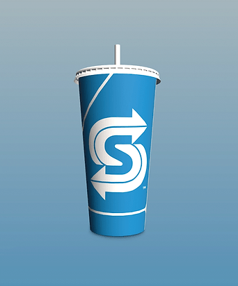
Cup & Subwrap
The cup was designed to spotlight the custom logo symbol, emphasizing its superhero-inspired identity. The Fantastic Four’s “4” symbol wraps around the cup, creating dynamic shape and movement, while a sixties-style starburst is integrated within the four to reinforce the retro aesthetic. On the back, the cup features the full logo lockup, with recycling information and the website placed neatly along the side for clarity and function.
The Subway wrapping paper pattern was designed to echo the collaborative logo lockup, featuring both the Subway identity and the Fantastic Four symbol. By repeating the “4” from the logo, a pattern frequently seen in Fantastic Four marketing and branding, the design creates a cohesive visual rhythm that aligns perfectly with the partnership. The lockup sits naturally within the negative space formed by the repeating four-pattern, resulting in a clean, integrated, and exciting 60s-esque design.

Subway x Fantastic Four Concept
Instagram Story
The Instagram story was created to embody the retro feel of the Fantastic Four movie, capturing its sixties setting and visual style. It opens with a vintage 60s television turning on to reveal a Subway commercial, then transitions into the collaborative logo lockup.
Each segment highlights a sandwich flavor themed to a different character, presented like a comic strip, followed by showcases of the packaging and cup meal, building excitement and bringing the nostalgic collaboration to life.

Subway x Fantastic Four Concept
In-Store Posters
The in-store signage was designed to highlight each hero sandwich, showcasing the characters’ powers through illustration, composition, and dynamic shapes. Each flavor is paired with the hero whose abilities it represents, making the visuals even more evocative and thematic. A subtle grain and simple gradient are incorporated into the background to evoke the sky, adding depth while keeping the overall design clean and cohesive.
Each title reflects the powers they have in a fun way, announcing the sandwich and hero in unison. Mr. Fantastic matches the stretchy, extra-cheesy All-American Club, shown with his elongated arms wrapping around the sub. The Thing is represented through The Beast, a heavy, meat-packed sandwich illustrated bursting through a wall to mirror his immense strength. Invisible Woman is linked to the Honey Mustard BBQ Chicken, whose sweet–tangy “forcefield” of flavor is depicted with a glowing protective aura around the sandwich. Human Torch aligns with the Hotshot Italiano, a spicy, fiery sub displayed engulfed in flames that echo his explosive, flame-on abilities. Together, the designs tie each hero’s signature traits to a sandwich that embodies their power.